


Overview
MyBamboo.ai is an AI-powered phone answering service built for small businesses. Businesses can create a customized AI phone agent that answers calls 24/7, responds to customer questions, books appointments and reservations, and handles routine requests when staff aren't available.
The experience is designed to be remarkably simple: businesses can sign up and configure their phone assistant in about five minutes. Bamboo learns the information it needs directly from the business's existing website, reducing the amount of manual setup required.
The challenge wasn't simply to explain what the technology does. It was to make a new and unfamiliar AI product feel approachable, useful, and human-centered—without falling into the visual language that had already become synonymous with AI.
Project
Duration
Tools
My Role
Website Design & Identity for MyBamboo.AI
3 months
Figma, Adobe Illustrator, Adobe Firefly
Lead UX/UI Designer
My Role
I led the UX and UI design for the MyBamboo.ai marketing website, taking the project from early concept exploration through visual direction and responsive page design.
Because MyBamboo.ai was a new startup, the project went beyond designing individual pages. I was also helping establish how the product should look, feel, and communicate its value to potential customers.
My responsibilities included:
Defining the visual direction and overall website experience
Developing the homepage structure and information hierarchy
Exploring different approaches to communicating an AI product visually
Creating and refining responsive UI designs
Developing the photography and imagery direction
Translating stakeholder and investor feedback into design iterations
The Challenge
MyBamboo.ai provides small businesses with a customizable AI phone assistant that answers calls 24/7.
The assistant can answer customer questions, book appointments, take reservations, and handle other routine requests. Businesses can customize its voice, inflection, vocabulary, and behavior to fit their brand.
Setup is intentionally simple: a business can create its phone assistant in about five minutes, with Bamboo learning key information directly from the company's website.
The technology itself was compelling. The challenge was communicating all of that without overwhelming visitors or leaning into the increasingly familiar visual language of AI.
The design question became:
How do you make an AI product feel approachable, useful, and human-centered without relying on robots, avatars, or generic AI imagery?
The website should communicate:
Bamboo is there when your business can't be. Whether a restaurant is closed, a barber is with a client, or a business is outside of normal operating hours, customers can still get an answer.
Process
I started by breaking the product down into its simplest customer-facing value propositions.
Rather than leading with technical details about AI, I focused on the real-world problems the product solves:
Missed calls → answered calls
After-hours → 24/7 coverage
Routine questions → automated support
Appointments and reservations → handled
Complex setup → five-minute onboarding
From there, I explored how those ideas could translate into a visual story.

Style Guide
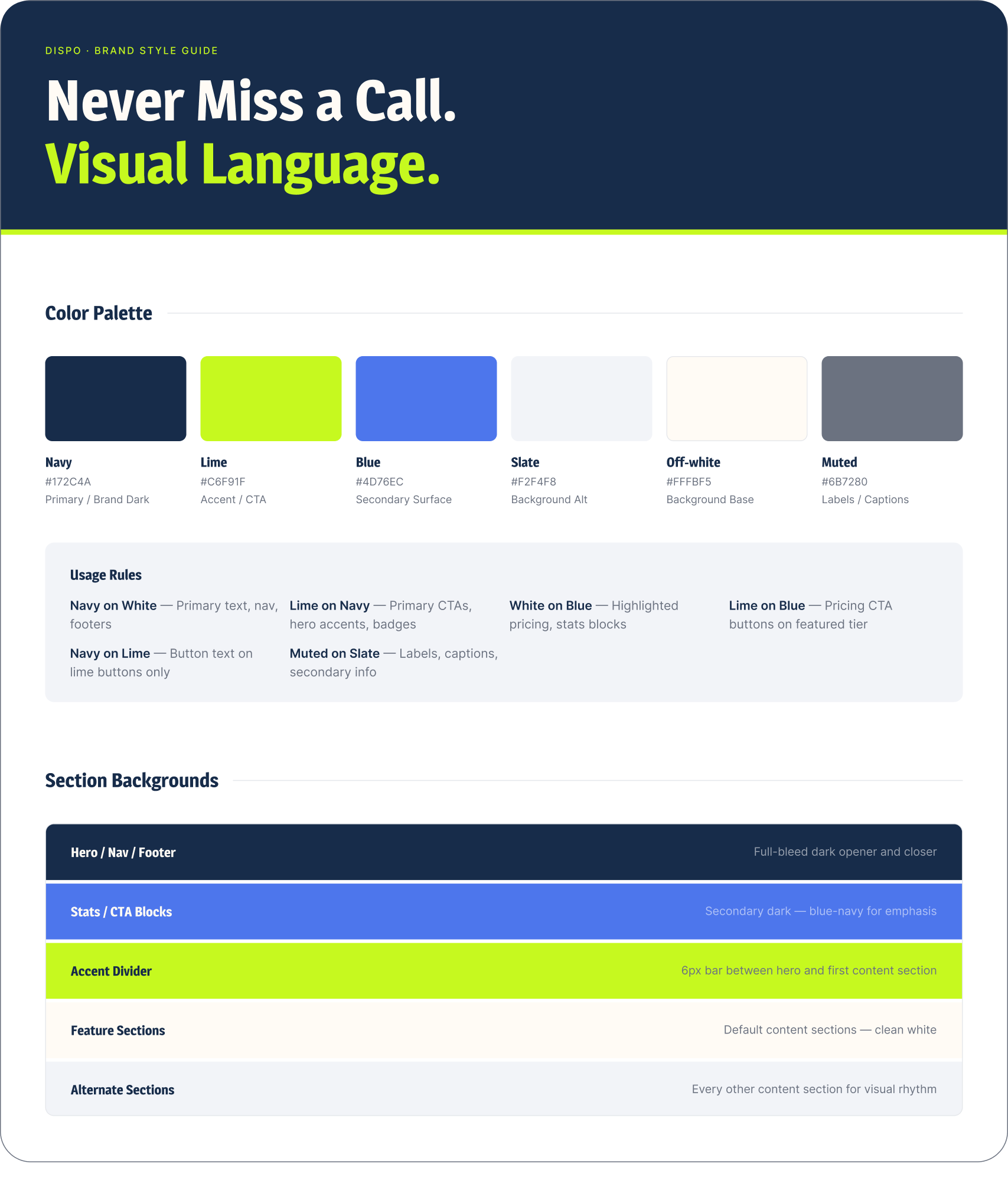
I wanted the MyBamboo.ai color palette to feel modern, energetic, and slightly edgy—a visual departure from the predictable blues and gradients often associated with AI products. The deep navy establishes a confident, trustworthy foundation, while the electric lime introduces personality and creates a memorable brand signature. Supporting blue, slate, and off-white tones provide enough flexibility to build hierarchy, contrast, and visual rhythm across the site without overwhelming the experience.
The palette was also intentionally designed to support the broader direction of the brand: approachable technology with a human, small-business focus. The high-contrast combinations keep the interface easy to scan and accessible, while the bold lime creates clear moments of emphasis for CTAs, key messaging, and interactive elements.
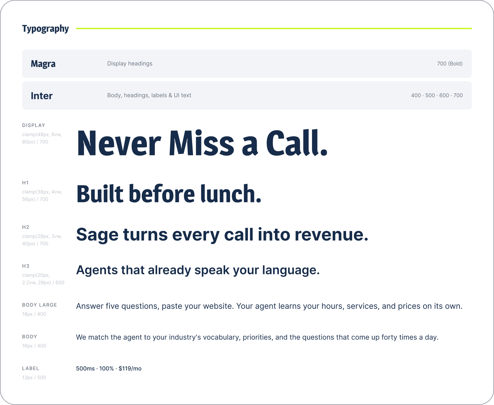
I chose Magra for display headings to give the brand a bold, distinctive personality that feels modern and slightly unconventional. Inter provides a clean, highly legible foundation for body copy, UI elements, and supporting content. Together, the two typefaces create a balance between expressive brand moments and functional usability, helping the interface feel energetic without sacrificing clarity or accessibility.
Iterations
Iteration 01 — The AI Agent
The initial homepage concept used AI agents as the primary visual representation of the product.
The intention was to communicate that Bamboo could interact with customers conversationally and sound more natural than a traditional automated phone system.
Visually, the direction was clean and minimal, and the color palette tested well. However, investor feedback identified a problem with the approach. The AI-agent imagery felt too similar to what other AI and calling companies were already using.
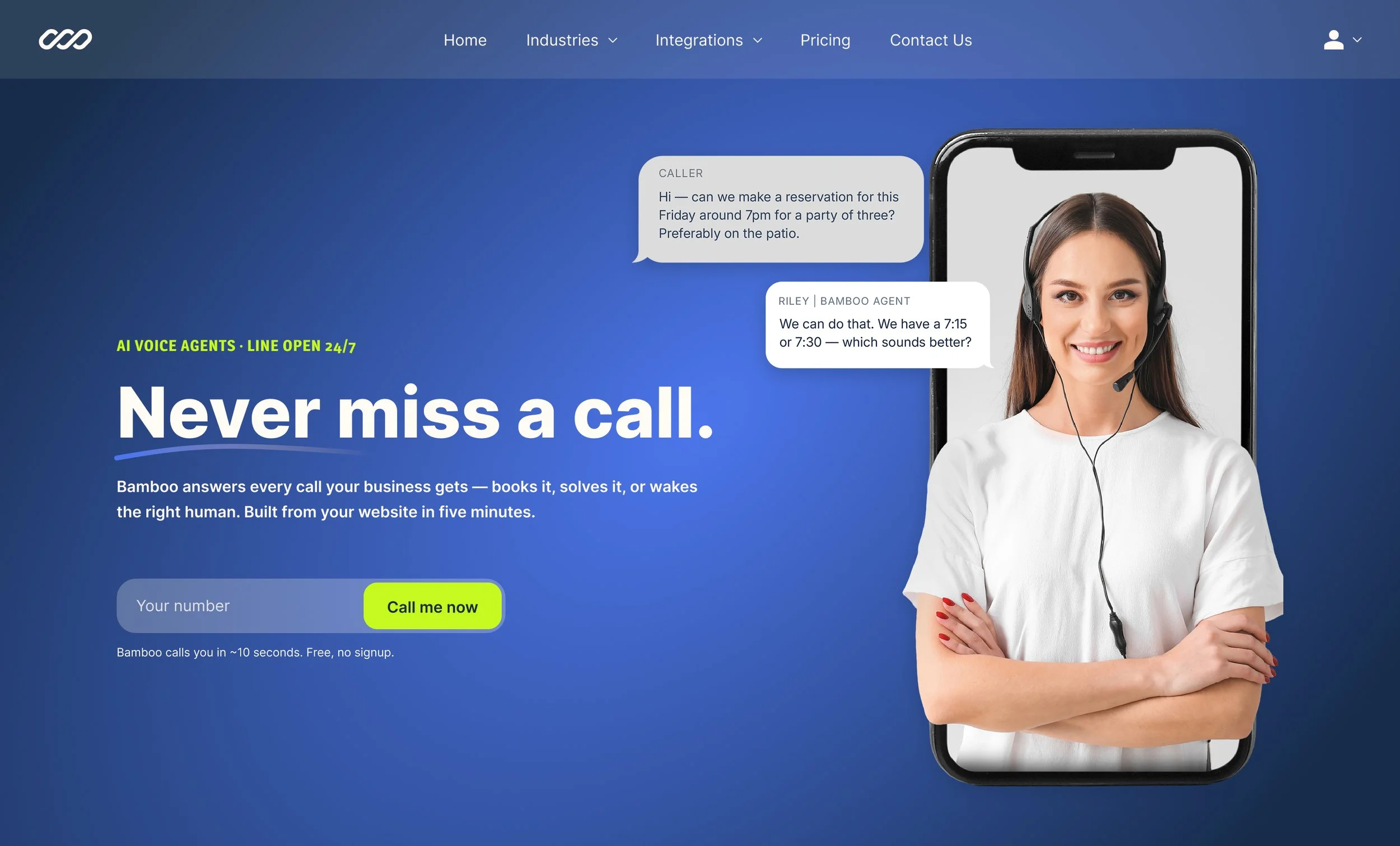
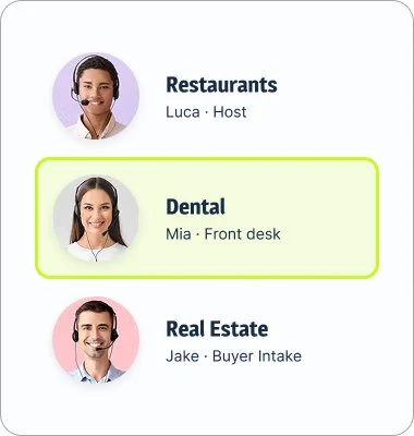
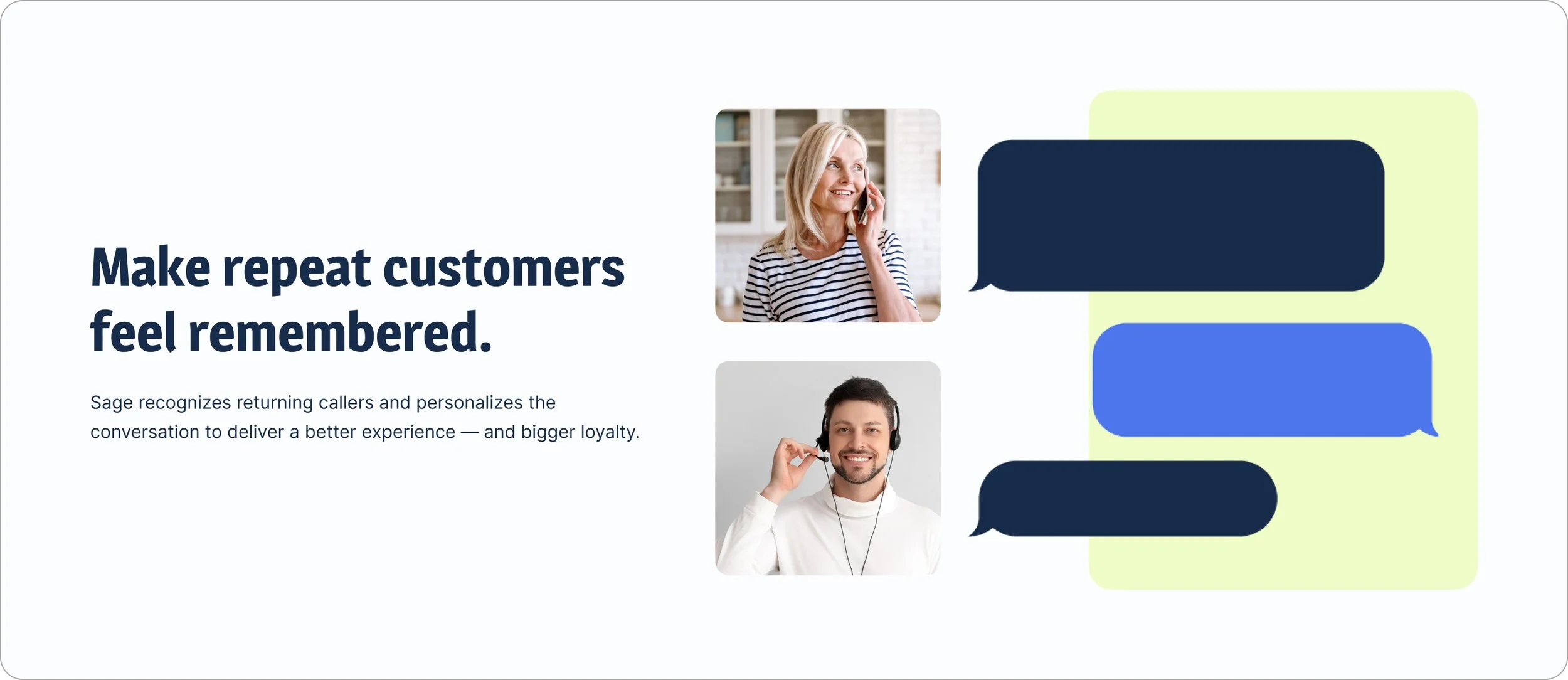
The feedback that sent the design in a new direction—
“The colors and branding work. The AI agents feel generic and like every other AI website.”
Design decision →
Instead of visually representing the AI, I decided to visually represent the problem Bamboo solves.
Iteration 02 — Show the Business, Not the Bot
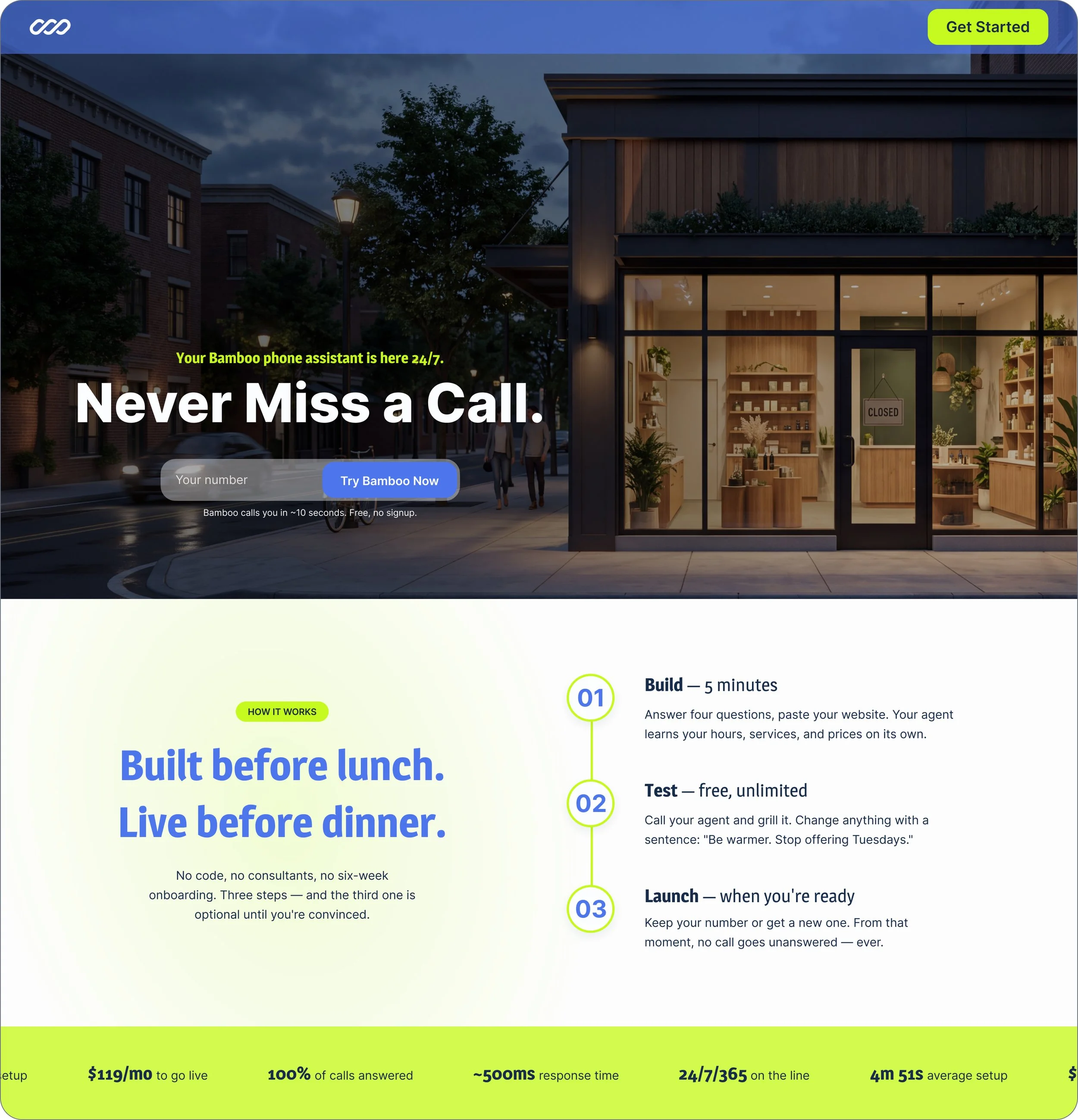
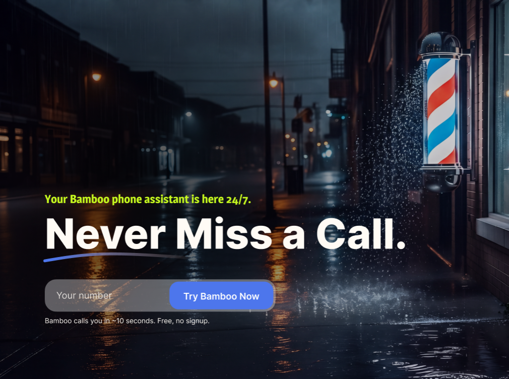
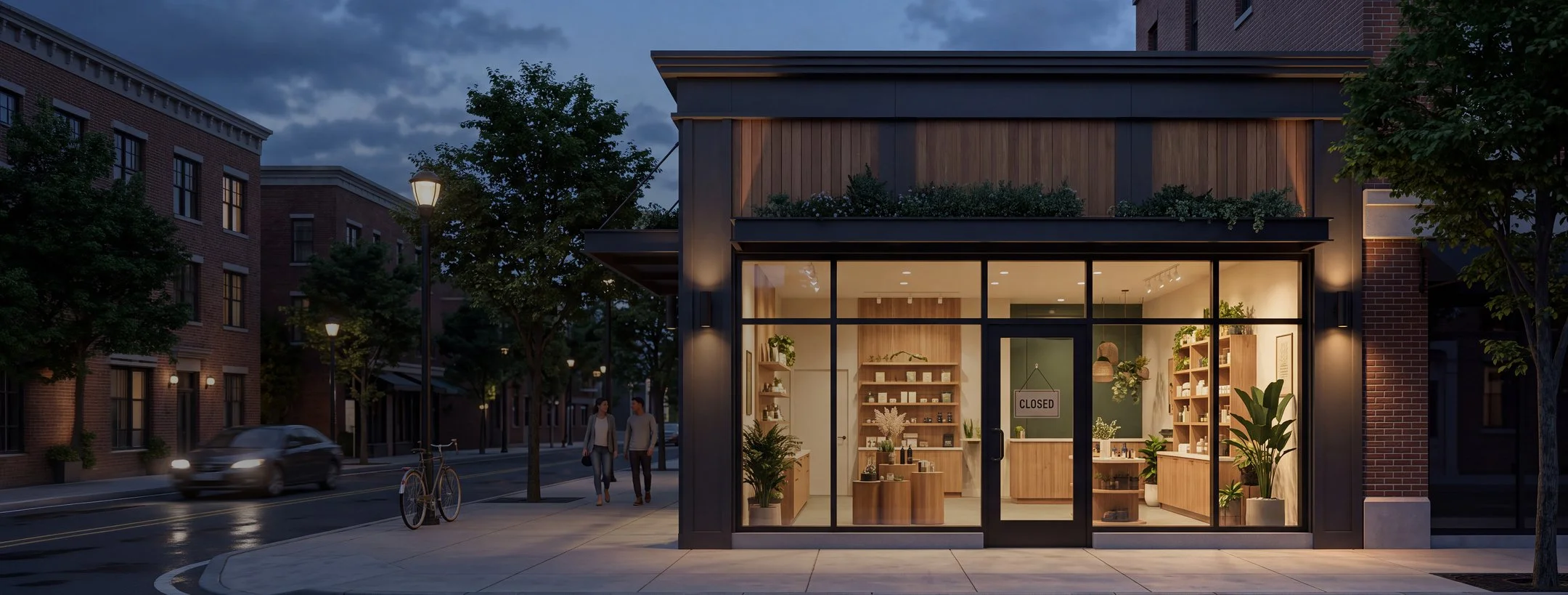
The second design direction completely removed the AI agents. Instead, I explored lifestyle photography showing small businesses after hours.
A closed storefront ● An empty restaurant
A business that looks unavailable—but isn't completely disconnected from its customers. This created a much more natural metaphor for the product. The photography didn't need to show people to communicate a human story. The imagery suggested:
The business is closed. Bamboo is still answering.
The hero image that won.
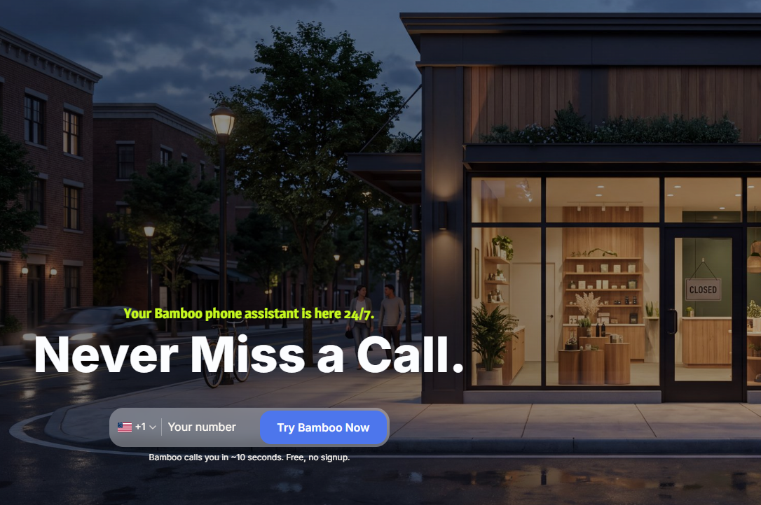
Final Design
HOMEPAGE
SIGN-UP WIZARD
DESIGN SOLUTION SUMMARY
01 — Lead with the benefit
The hero focuses on the core customer problem rather than technical product language.
Most businesses aren’t available 24/7. Bamboo can be.
This creates an immediate connection between the product and a familiar small-business challenge.
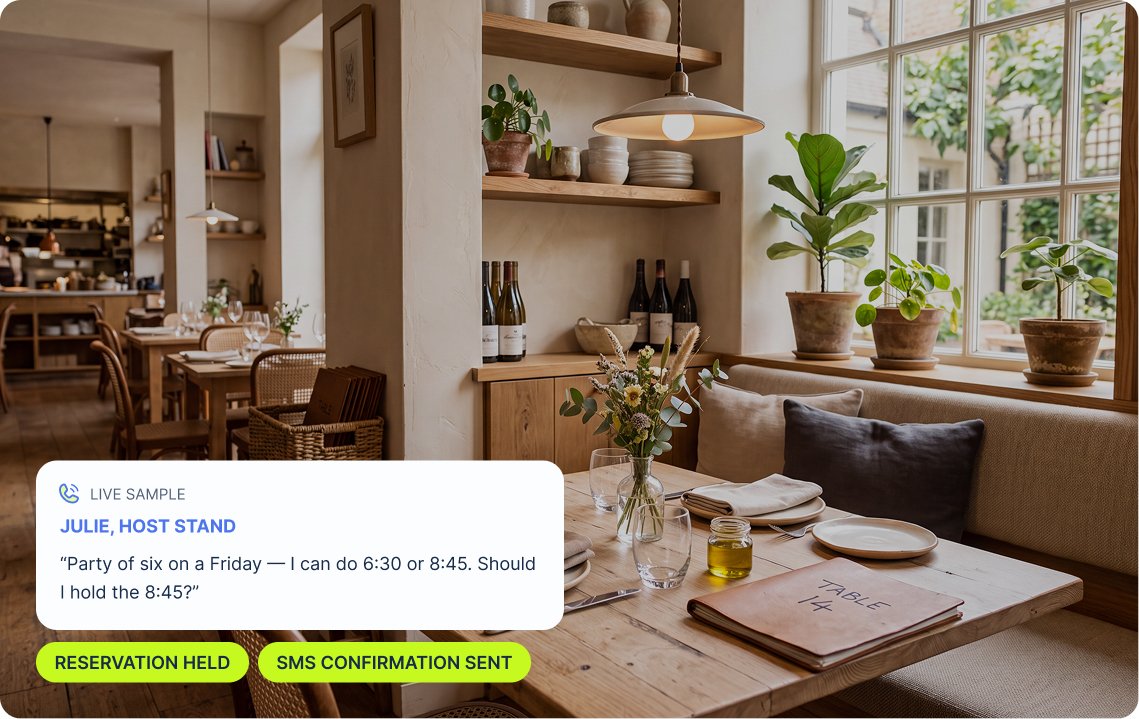
02 — Use photography to tell the story
After-hours photography became a major part of the visual identity.
Rather than showing robots or futuristic motifs, the imagery shows the environments Bamboo supports.
The result feels more relatable and less like a traditional AI landing page.
03 — Make the technology approachable
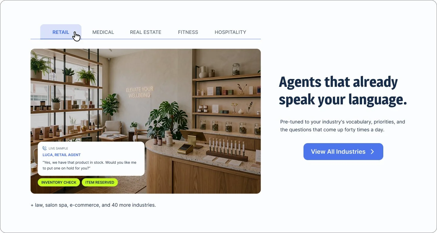
The interface uses a minimal visual system and a distinctive lime-green accent to create a modern technology brand without making the experience feel overly technical. The lime green also became a strong visual anchor for CTAs and interactive elements.
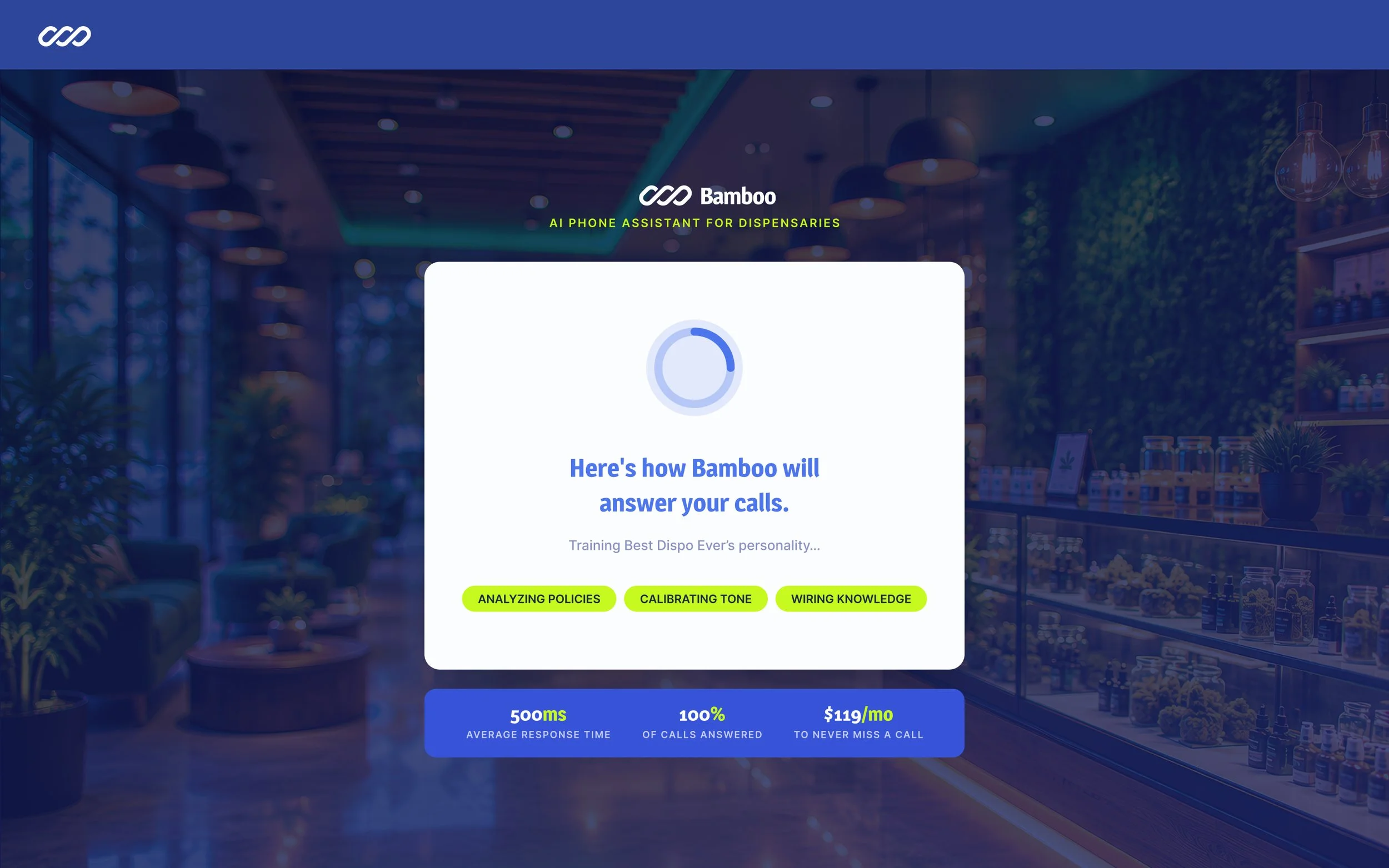
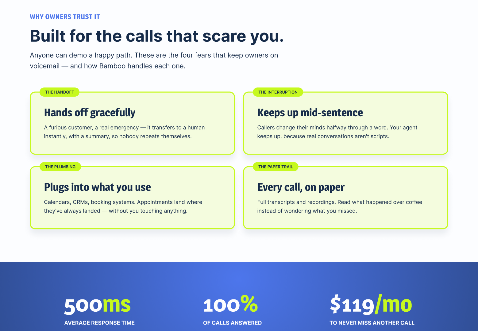
Rather than simply listing features, the website connects capabilities to recognizable business needs.
Answer customer questions.
Book appointments.
Take reservations.
Handle calls after hours.
Route customers to the right person when needed.
This makes the technology easier to understand without requiring users to understand how the AI works.
04 — Explain capabilities with outcomes
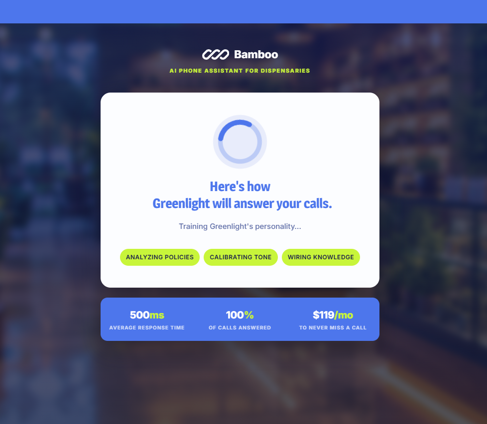
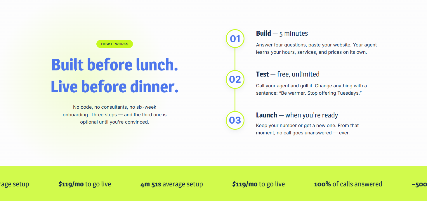
05 — Reinforce the five-minute setup
One of the biggest barriers to adopting new software is the perceived effort required to get started. The website therefore makes Bamboo's setup process part of the product story. The message is simple: Five minutes to build your phone assistant.
Takeaways
The biggest lesson from this project was that visually representing the technology wasn't necessarily the best way to communicate its value. Removing the AI agents allowed the product to feel more distinctive while giving the brand a more human and relatable story.
Show the problem the product solves.
A closed storefront communicates the value of 24/7 phone coverage more naturally than an illustration of an AI assistant answering a phone. Investor feedback wasn't limited to visual preferences. It helped uncover a stronger narrative direction for the entire site. The evolution from AI agents to after-hours businesses changed not just the imagery, but the way the product itself was communicated.
Design for the customer, not the technology.
MyBamboo.ai is ultimately a technology product, but its customers are small-business owners dealing with very human problems: missed calls, busy staff, after-hours customers, and limited resources. The final design puts those realities first.